Client :
Lamine immobilier, Morocco
Category :
Visual Identity Design
industry :
Real Estate
deLivrables :
Logotype, Visual Identity
Lamine Immobilier
Real estate company
“Lamine Immobilier is a corporation that sells, rents, and manages real estate holdings. The primary goal of this project was to create a visual identity that reflect the company’s quality, trustworthiness, and modernity.
To reach this goal, we collaborated extensively with Lamine Immobilier to better understand its beliefs and goals. To build a distinct and distinguishing character, extensive study into the real estate market and competitors was conducted.”
The process
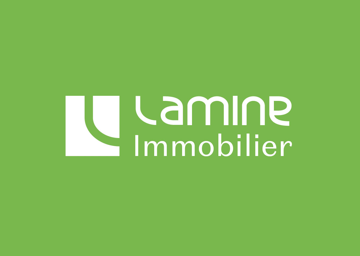
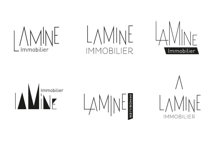
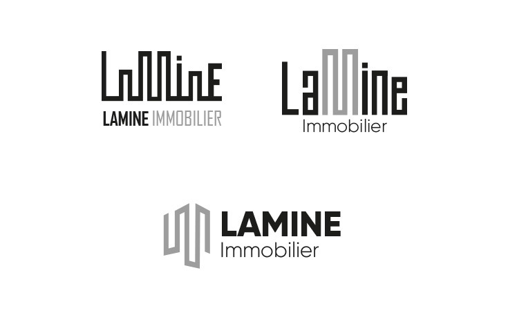
The creation of the visual identity began with the design of a logo. Several ideas were considered, with an emphasis on elements like as robustness, dependability, and modernity. After several revisions, a final logo was chosen, featuring the letter ‘L’ of Lamine Immobilier, conjuring a bird’s-eye view of a residential site plan, and the name in a custom font.
Visual identity
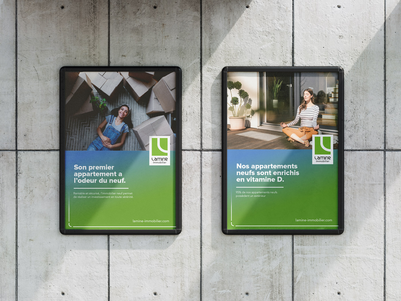
In addition to the logo, various visual elements were created, including colors, typefaces, and graphic patterns. The company’s professionalism was reflected in the use of subdued and elegant colors, while current fonts were chosen to portray a contemporary image.
Once the visual identity was established, it was used on a variety of communication tools, including business cards, signs, real estate listings, and the company website. The goal was to provide visual consistency across all communication channels, which would improve brand identification.

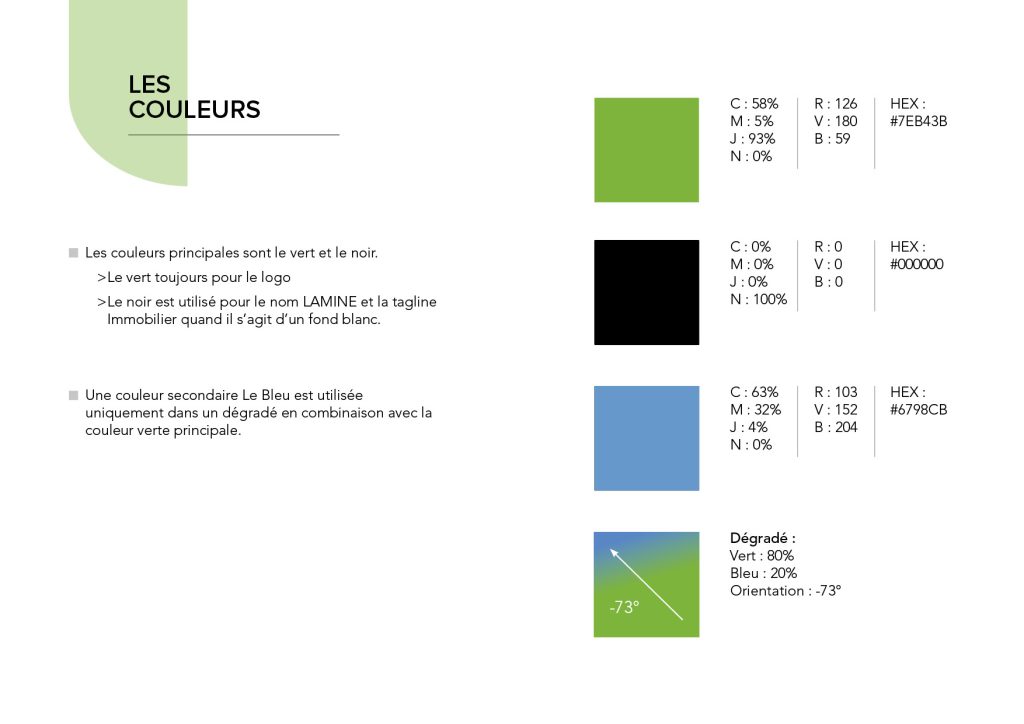
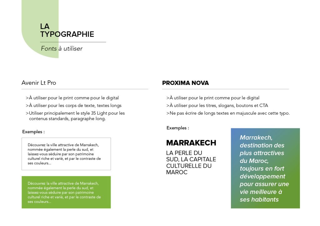
Aperçu de la charte graphique
