Client :
Global Immo France
Category :
Visual Identity Design
industry :
Real estate
DELivrables :
Logotype, Visual identity
Global Immo France
Real Estate Consulting
“Global Immo France, a real estate company specialising in the Paris region, has launched a strategic push to boost its brand by redesigning its logo and visual identity.
The goal is to develop a distinct picture that expresses the breadth of its services while gently embracing iconic characteristics of Paris, represented by the Eiffel Tower.”
Context and Objectives
The necessity to increase Global Immo France’s visibility in the real estate market prompted a revision of its visual identity. The goals included developing a recognisable, distinct visual brand that reflected the company’s experience in Parisian real estate.
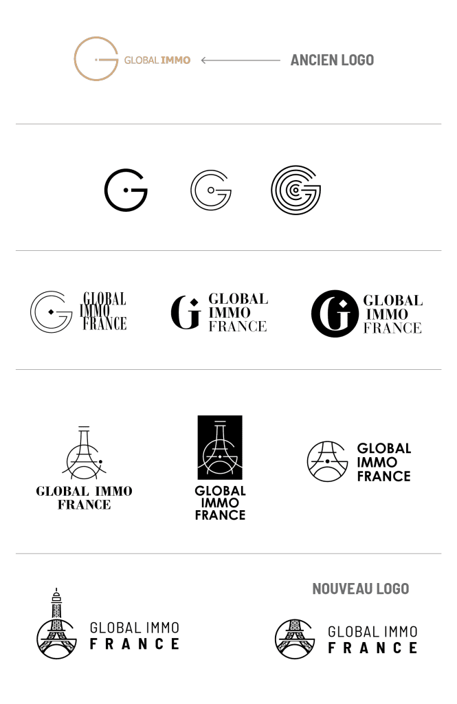
Research and Inspiration
A thorough examination of the Parisian real estate industry and competing companies’ logos was undertaken. Parisian architecture served as inspiration, with the Eiffel Tower standing out as a symbol of the City of Light.
Concept design
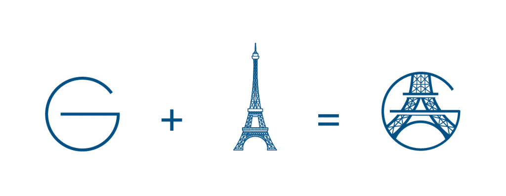
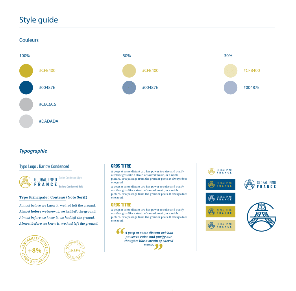
The initial proposal united the letter ‘G’ from ‘Global’ with the Eiffel Tower’s construction pattern. The use of dark blue signifies dependability, stability, and professionalism, whereas gold represents exclusivity, prestige, and quality.
Logo Design
The final logo is an attractive blend of the stylized letter ‘G,’ which delicately incorporates the curves of the Eiffel Tower. The sleek and modern lines reflect Global Immo France’s forward-thinking approach to real estate. The colour scheme, dark blue and gold, emphasises sophistication and authenticity.
Conclusion
The makeover of Global Immo France’s visual identity resulted in a cohesive and memorable picture. The use of dark blue and gold, as well as the discreet incorporation of the Eiffel Tower, has helped to create a distinct visual identity that reflects the company’s quality and competence.

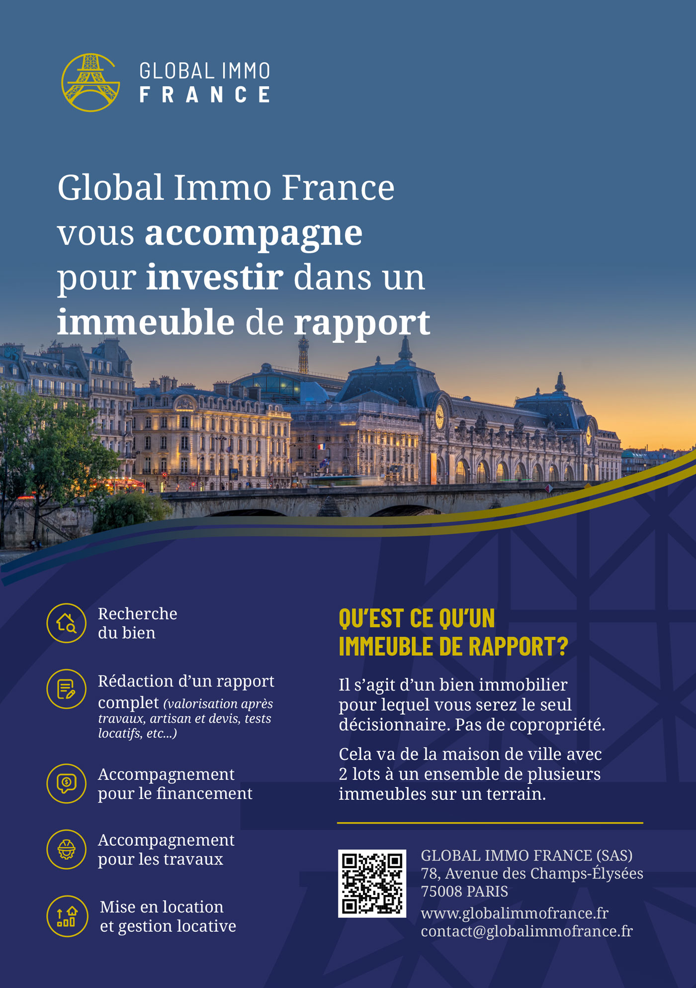
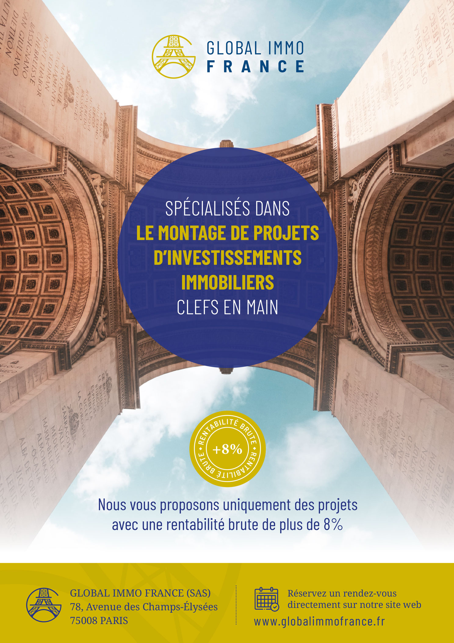
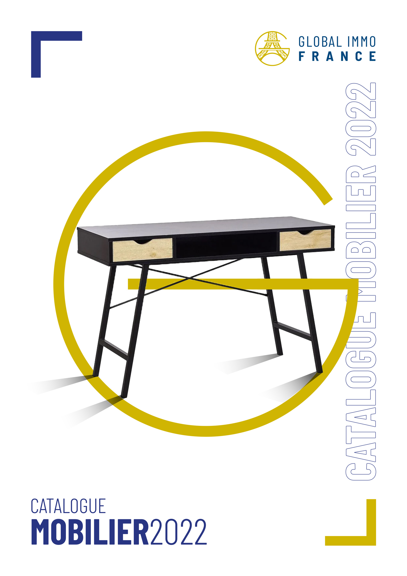
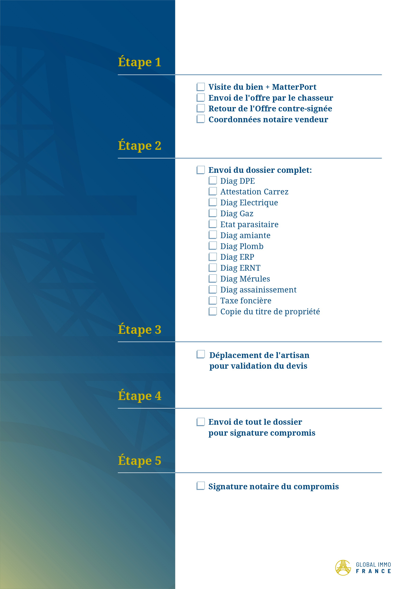
Adaptation to Visual Supports
The logo has been adapted to various visual materials, such as business cards, signage, brochures, and the website. The consistent application reinforces the unity of the visual identity across all channels.
